
This is an archived article that was published on sltrib.com in 2012, and information in the article may be outdated. It is provided only for personal research purposes and may not be reprinted.
It's not just a division of political ideologies that ails America. It's a division of design.
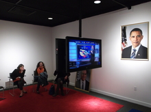
That was the observation of two University of Utah educators watching the results at the Utah Museum of Contemporary Art's exhibit, "Your Land/My Land: "Election '12."
The graphic presentation of the two TV networks being broadcast in the exhibit – MSNBC on the "blue" side, and Fox News on the "red" side, were a contrast in graphic styles, said Kerry O'Grady, education director for the Utah Museum of Fine Arts.
MSNBC's graphics were "lean, and give you the information smoothly." The Fox graphics are "animating the numbers."
Angela Espinosa, a professor of Spanish at the U., agreed. Fox "doesn't provide the information long enough. It's distracting and confusing," Espinosa said. "It was like looking at a poorly designed webpage."
O'Grady wanted to see the results in the context of the minimalist exhibit, which artist Jonathan Horowitz mounted in seven locations nationwide.
"I'm interested in the project, in the juxtaposition of the performance of politics with the substance of it," O'Grady said.
Espinosa said she "thought this would be one of the more civilized environments" to watch the results. She was surprised that "it wasn't more contentious, because I thought people would self-identify" as red or blue.